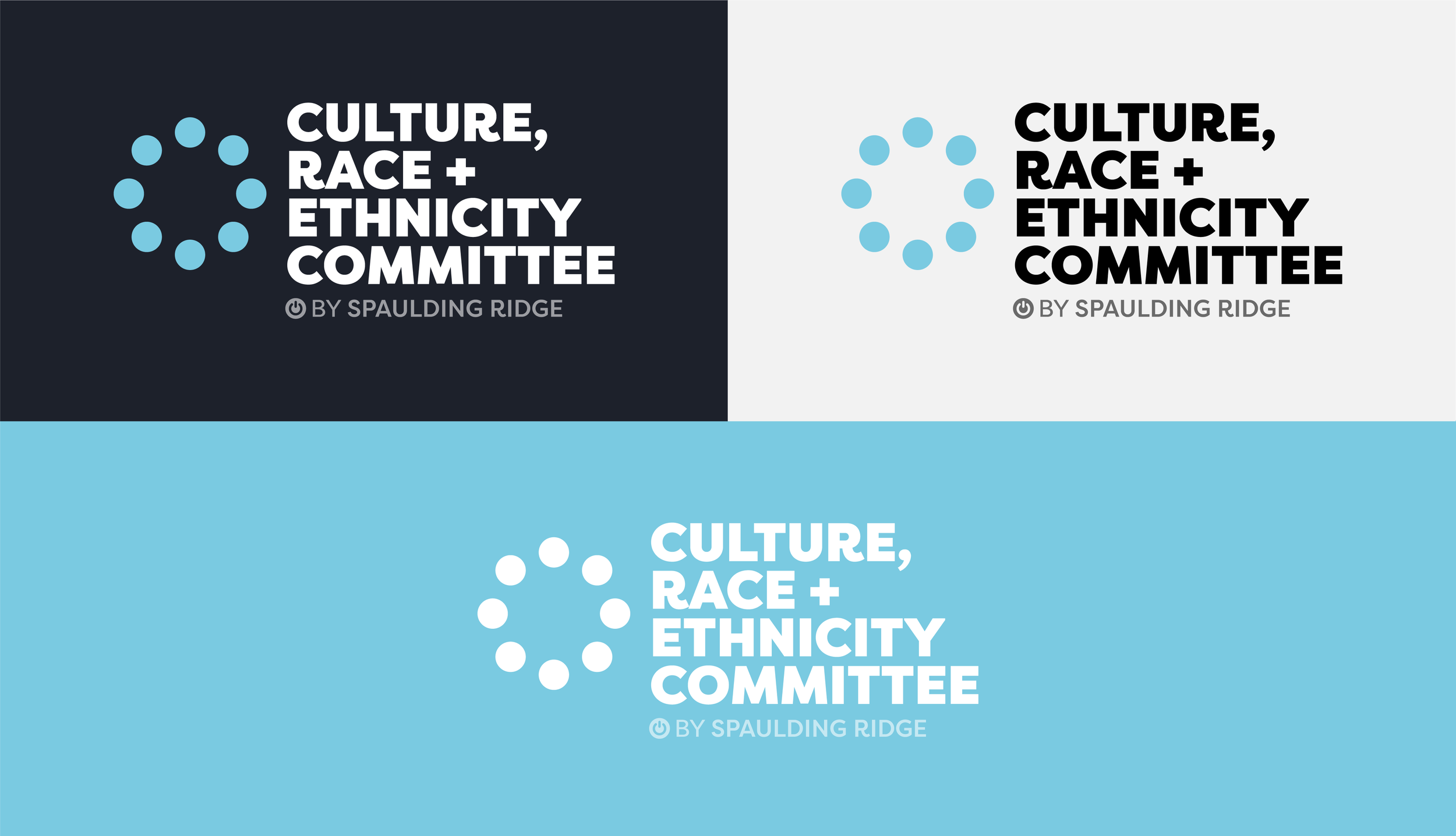
The goal was to create a unified brand where each committee’s logo combined creates the DEI logo.
The DEI Committee leaders and I collaborated on developing a brand identity for the DEI groups. We wanted to brand the committees in a way that represents unity, togetherness, and teamwork.
The number of DEI Committees will inevitably increase as Spaulding Ridge continues to scale. We want to maintain the ability to add new brand identities for future committees, for that reason, the overall DEI logo will be a combination of all committee logomarks.
DE&I Branding
Case Study
Role Graphic Design Lead
Tools Illustrator, Photoshop, After Effects
Shape and color are both methods of communicating ideas, feelings, and characteristics.
How can we leverage both elements to showcase our diversity, equity, and inclusion groups in a meaningful and impactful way?
The perceived meaning behind shape and color can be impacted by a variety of factors: composition, life-events, personal experiences, politics, and human psychology.
There have been research studies conducted in trying to better understand the associated meanings behind shapes + color. Based on this research, we have assigned each existing DEI committee with a shape and color to represent their goals and missions.
Shapes and their associated meanings:
Colors and their associated meanings:
Logo Structure
The DEI Umbrella logo is composed of three elements: the logomark, logotype, and Powered By phrase.
The umbrella logo was designed with scalability in mind. We wanted to leave opportunity to add new committees as the company grows. Each icon represents a different committee.
Individual committee logos are composed of the same elements, but with a focus on their individual logomarks.
There are two committee logo formats that can be leveraged: horizontal and stacked.


